 5 Terms
Home > Terms > English, UK (UE) > Gap logo
Gap logo
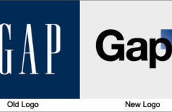
Gap has used the same logo for over 20 years, instantly recognisable with its stretched, white letters against a navy blue background. Yet the company recently released a new logo, created in collaboration with the customer community, to widespread indignation. It has been called a “Microsoft Word” creation and a “prototypical brand panic move”. Gap is already rethinking the change.
This is auto-generated content. You can help to improve it.
0
0
Improve it
- Part of Speech: noun
- Synonym(s):
- Blossary:
- Industry/Domain: Apparel
- Category: Coats & jackets
- Company: Gap
- Product:
- Acronym-Abbreviation:
Other Languages:
Member comments
Terms in the News
Featured Terms
Industry/Domain: Travel Category: Travel sites
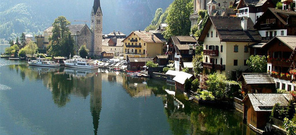
Hallstatt
Situated in the south-western shore of the Hallstätter See, Hallstatt is a scenic village with its mountain-hugging chalets, elegant church spires and ...
Contributor
Featured blossaries
karel24
0
Terms
23
Blossaries
1
Followers
The Asian Banker Awards Program
Category: Business 1  5 Terms
 5 Terms
Browers Terms By Category
- Cardboard boxes(1)
- Wrapping paper(1)
Paper packaging(2) Terms
- Fuel cell(402)
- Capacitors(290)
- Motors(278)
- Generators(192)
- Circuit breakers(147)
- Power supplies(77)
Electrical equipment(1403) Terms
- Pesticides(2181)
- Organic fertilizers(10)
- Potassium fertilizers(8)
- Herbicides(5)
- Fungicides(1)
- Insecticides(1)
Agricultural chemicals(2207) Terms
- Advertising(244)
- Event(2)


